
🕑 6 min read
Everyone watches price charts.
The money that actually moves markets watches something else entirely. While retail traders stare at candlesticks and draw trendlines, institutions and whale wallets are reading the blockchain itself – tracking every coin that enters an exchange, every long-term holder who panics, every miner forced to sell.
And here’s what most people don’t realize: all of that data is public. Free. Updated every block. Learning to read on-chain data is the closest thing to an unfair advantage in crypto. You’re essentially reading Bitcoin’s financial statements in real time – except unlike a public company’s quarterly report, this one updates every ten minutes.
This guide breaks down six metrics you can start using today, with real numbers from April 9, 2026.
Charts show the past – on-chain data shows what’s next
A price chart tells you what already happened. Bitcoin hit $71,934 today. Great. But it can’t tell you why – or whether the move has legs.
On-chain analysis flips the script. Instead of looking at price alone, you’re looking at the behavior of every wallet on the network. Who’s buying. Who’s selling. Who’s moving coins to exchanges (usually a prelude to selling) and who’s pulling them off (accumulation).
“On-chain data gives you a level of transparency into actual holder behavior that simply doesn’t exist in traditional markets,” said Willy Woo, one of the first analysts to build Bitcoin valuation models from blockchain data.
That transparency matters. When 10,000 BTC silently move off exchanges overnight, the chart won’t show it. But on-chain data catches it hours before the price reacts.
Three metrics that spot Bitcoin tops and bottoms
Not all on-chain metrics matter equally. Three of them – MVRV, SOPR, and NUPL – form a diagnostic trio that professional analysts check daily. Think of them as blood pressure, heart rate, and temperature for the crypto market.
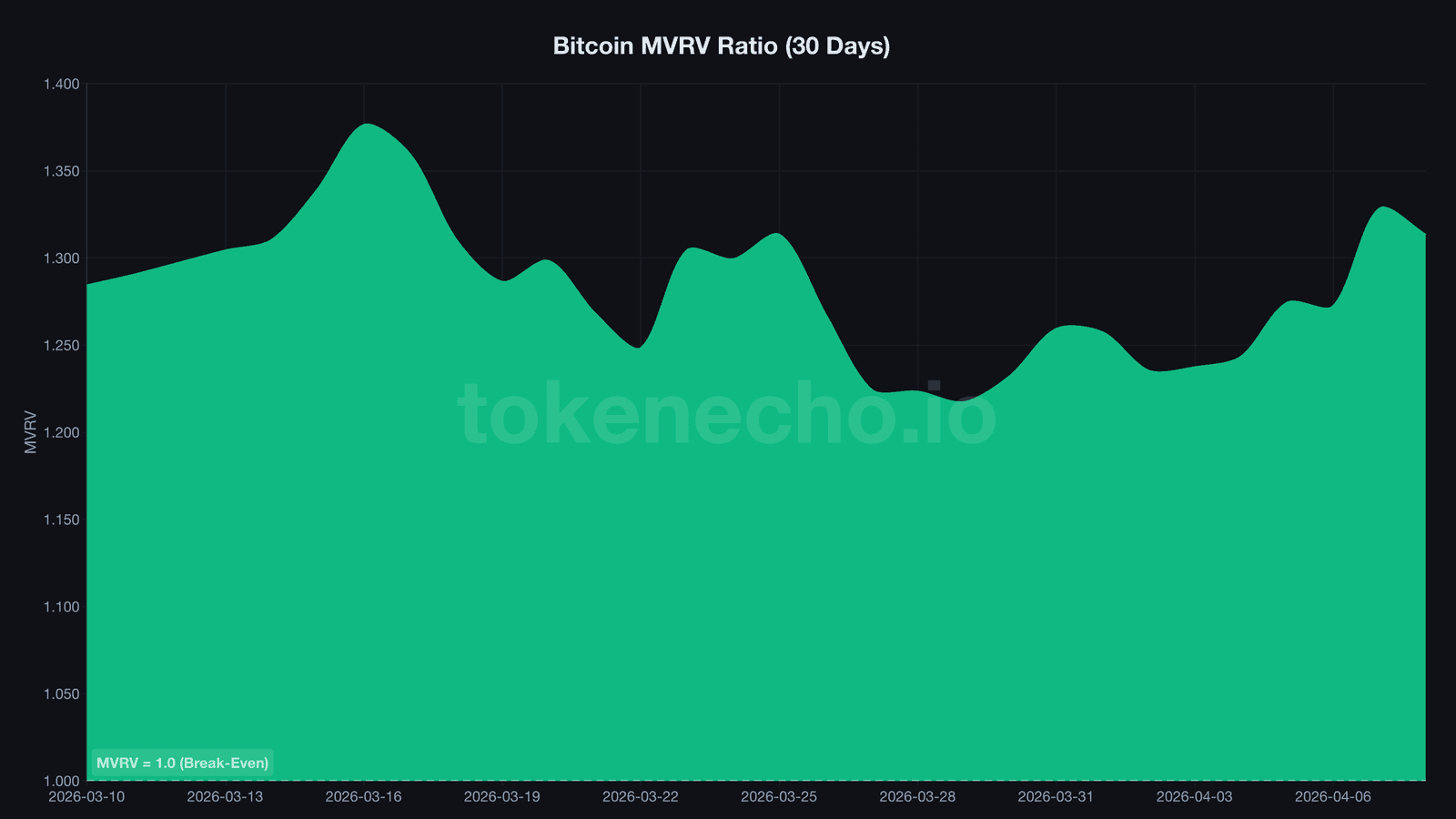
MVRV ratio, the Market Value to Realized Value ratio, compares Bitcoin’s current market cap to the aggregate cost basis of all coins. Right now it sits at 1.31. That means the average BTC holder is sitting on a 31% unrealized gain. Sounds healthy – but context matters. During the November 2021 top, MVRV hit 3.12. During the FTX crash in November 2022, it dropped below 1.0, meaning the average holder was underwater.
When MVRV dips below 1.0, historically, that’s been generational buying territory. Every single time.
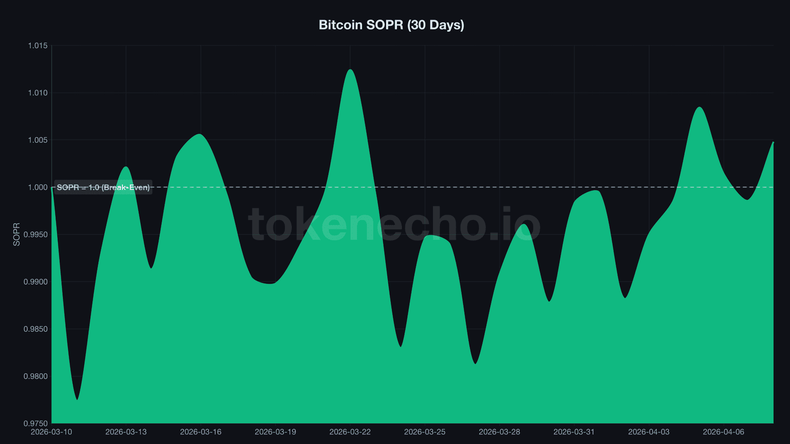
SOPR, the Spent Output Profit Ratio, measures whether people selling today are locking in profits or losses. A SOPR above 1.0 means sellers are profitable on average. Below 1.0 means they’re selling at a loss – usually a sign of capitulation. Today’s reading: 1.005. Barely profitable. But what caught our attention this week is the LTH-SOPR – the same metric isolated to long-term holders – which sits at 0.82. Long-term holders are selling at an 18% loss. That’s unusual. The last time LTH-SOPR stayed below 0.85 for more than two weeks was, you guessed it, November 2022.
NUPL, Net Unrealized Profit/Loss, tracks the overall paper gains or losses across all Bitcoin holders. At 0.238, the market sits in what analysts call the “hope/fear” zone. Not euphoric. Not capitulating. Just… waiting. For reference, NUPL above 0.75 has historically marked cycle tops (everyone’s in profit and getting greedy), while readings below 0 marked bottoms (everyone’s underwater).
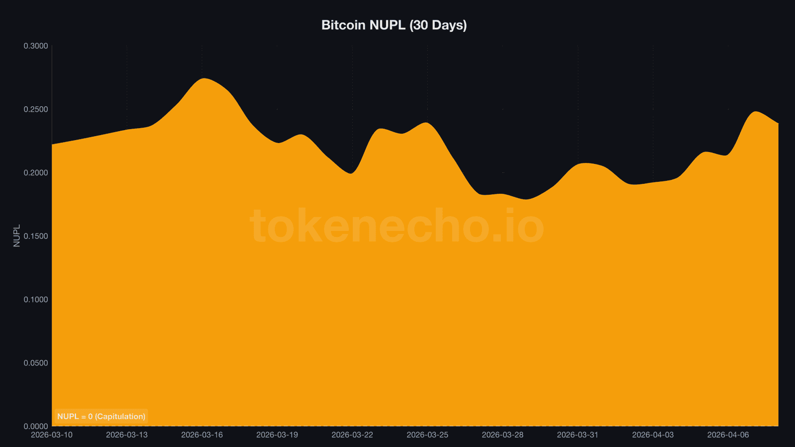
Reading these three together tells a story no chart can. Right now: moderate unrealized gains (MVRV 1.31), sellers barely breaking even (SOPR 1.005), long-term holders bleeding (LTH-SOPR 0.82), and the broader market stuck between hope and fear (NUPL 0.238). That’s a market in limbo – not a market in freefall and not one about to rip.
Exchange flows and miner stress – the signals most traders miss
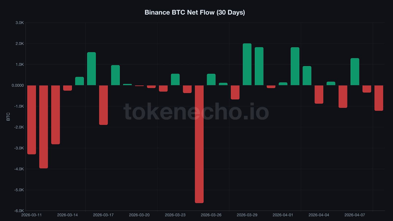
Where are 637,000 Bitcoin sitting right now? On Binance alone, according to CryptoQuant data pulled this morning.
Exchange reserves track the total BTC held on centralized exchanges. When reserves drop, it typically means holders are withdrawing coins to cold storage – a sign of accumulation and reduced selling pressure. When reserves spike, someone’s getting ready to dump.
“Declining exchange reserves have preceded every major Bitcoin rally since 2020,” said Ki Young Ju, CEO of CryptoQuant. And today? Binance saw a net outflow of 1,218 BTC in the past 24 hours. Over the last seven days, five out of seven days showed net outflows. That’s a slow, steady drain – not panic buying, but patient accumulation.
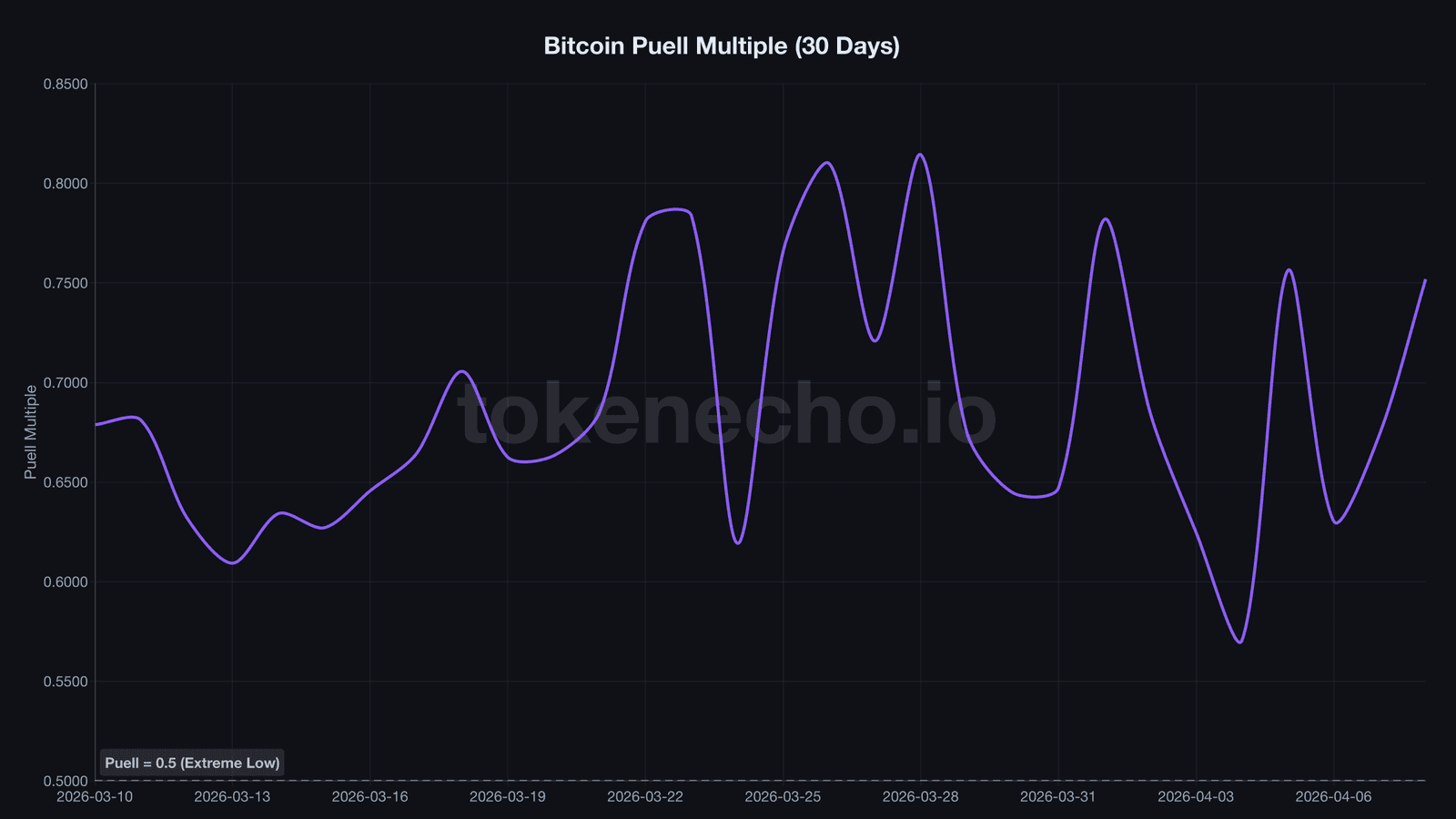
Then there’s the Puell Multiple, a metric that compares miners’ daily revenue to its 365-day moving average. It essentially tells you whether miners are under stress. At 0.752, it’s running 25% below the annual average. Miners earn less per coin mined, which historically squeezes out the weakest operations and reduces sell pressure. The Puell Multiple dropped below 0.5 twice – during the COVID crash in March 2020 and the FTX collapse in late 2022. Both marked cycle bottoms.
Think of exchange flows and miner data like a supply chain report for Bitcoin. If suppliers (miners) are struggling and inventory on shelves (exchange reserves) keeps shrinking, the next demand surge hits a thinner market. That’s how supply squeezes form – quietly, while everyone’s watching the price chart going sideways.
Five free platforms most traders don’t know about
Pull up any of these and you can start reading on-chain data in minutes. No coding required. No paid subscription needed for the basics.
CryptoQuant is where we’ve been pulling data all morning for this article. Their free tier gives you exchange flows, MVRV, SOPR, NUPL, Puell Multiple, and dozens more. The dashboard is clean, the API is well-documented, and the community alerts (called Quicktakes) surface anomalies before they hit Twitter. Start here.
Glassnode Studio offers another strong free tier – particularly good for long-term holder behavior and supply dynamics. Their weekly “The Week On-Chain” report is genuinely one of the best free research products in crypto.
Arkham Intelligence takes a different angle. Instead of aggregate metrics, Arkham tracks individual wallets – you can see exactly what BlackRock’s ETF wallet holds, what Jump Trading is moving, or when a dormant Satoshi-era wallet wakes up. If you’ve ever wanted to track crypto whale movements in real time, Arkham is where to start.
CoinGecko – yes, the basic price tracker – quietly offers on-chain data too. Their coin pages now include supply distribution, exchange reserves, and developer activity. It won’t replace CryptoQuant for deep analysis, but it’s a solid one-stop overview.
Dune Analytics is for the adventurous. It’s a community-built SQL dashboard platform where anyone can query blockchain data directly. The learning curve is steeper, but the payoff is total customization. Want to know exactly how many wallets hold more than 100 BTC? Someone’s already built that dashboard on Dune.
None of these platforms existed ten years ago. The fact that retail investors now have access to the same on-chain data that funds pay six figures for is one of crypto’s most underrated asymmetries.
For a deeper look at how on-chain signals shape Bitcoin’s price trajectory, check out our Bitcoin price prediction 2026-2030.
On-chain data tells one story right now. The price chart tells another. Which one catches up to the other will define the rest of Q2.
This is not financial advice. DYOR. Data as of April 9, 2026.
Sources
- CryptoQuant API – MVRV, SOPR, NUPL, Puell Multiple, exchange reserves, netflow data (accessed April 9, 2026)
- CoinGecko API – BTC price, market cap, supply data (accessed April 9, 2026)
- CryptoQuant.com – free on-chain analytics dashboard
- Glassnode.com – on-chain market intelligence
- Arkham Intelligence – wallet tracking
- Dune Analytics – community-built blockchain dashboards
Leave a Reply